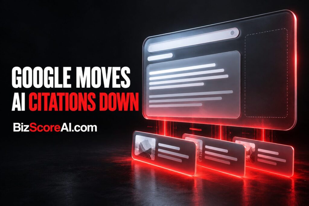
Readers of AI Overviews on desktop may soon find citation cards stacked beneath the answer rather than anchored to the right side of the screen. Google is running a new test that moves the citation block to the bottom of the response, with a show all control that expands the list into a larger citation area below the generated text.
What the new layout looks like
In the test, inline links inside the AI Overview still work the way they normally do on hover, but the visible citation cards are pulled out of the right rail and placed under the answer. A show more button sits at the bottom of the response, and expanding it reveals a full list of source links in a stacked, card-style block. With the cards collapsed, only the inline link icons remain visible in the answer itself, with no right-side citation column at all.
How it compares to the current right-side design
The standard desktop AI Overview shows citation cards down the right edge of the answer, with a show more control that expands the list while keeping the cards in that side column. The new test removes that right-side column entirely. The cards live at the bottom instead, and the right rail of the response is empty. Inline hover links inside the answer continue to behave the same way in both versions.
Is this the first time Google has tried it
No, this is at least the third pass at a bottom placement. Google has tested moving citation cards to the bottom of AI Overviews on desktop before, including a test in March 2026 and an earlier variation in September 2025. The current version is described as a cleaner take on those earlier attempts, with a more prominent stacked citation area once the show more control is expanded.
Why a bottom layout may appeal to Google
Stacking citations under the answer gives the citation area more room to breathe than a narrow right rail, which can make the source links look more inviting to click. It also frees up the right side of the response, where future ad units, follow-up suggestions, or other modules could eventually appear. A bottom block is also easier to scan on shorter windows or on displays where the right rail gets crowded out by other on-page content.
What is still undecided
One open question is what happens before a reader clicks show more. With the citation cards collapsed at the bottom, the response shows only the inline link icons, and the source links below the answer are hidden. If Google were to expand the citation block by default, the bottom cards would be visible the moment the AI Overview loads, which would solve that discoverability gap and give a reader the full list of sources without an extra click.
A balanced middle ground would be to keep the right-side column and add the bottom block at the same time, so a reader sees citation cards in both places. That would preserve the at-a-glance source list in the right rail while giving the bottom block the extra space the test is designed to explore.
What this means for site owners and SEOs
Citation placement matters because it changes how visible the linked sources are inside an AI Overview. A bottom block with a larger card area, if it ships broadly, would push the linked pages into a more prominent visual zone, which can lift click-through on the citations themselves. A short check of where a domain is currently cited across AI Overviews is the kind of measurement work an AI visibility audit covers, and BizScoreAI runs an AI Scan that reports how a business listing looks to AI search.
FAQ
What is Google testing with AI Overviews right now?
Google is testing a layout that moves citation cards from the right side of the desktop AI Overview to a stacked block at the bottom of the answer, with a show more control that expands the full list of source links.
Has Google tested bottom citation cards in AI Overviews before?
Yes. Google has run at least two earlier tests of bottom-placed citation cards, one in March 2026 and an earlier variation in September 2025. The current test is a cleaner version of those attempts.
What does the new citation layout look like before a reader clicks show more?
Before the show more control is expanded, the right-side citation column is gone and the response shows only the inline hover links inside the answer. The stacked citation cards are hidden below the answer until the reader chooses to expand the list.
Related coverage
- Google AI Mode vs AI Overviews: Study Reveals Divergent Search Behavior – BizScoreAI
- Google’s AI Overviews Aren’t Protected Speech: A German Court Ruling That Could Reshape AI Search – BizScoreAI
- AI Overviews Are the New Map Pack: How Small Businesses Get Cited by Google’s AI – BizScoreAI
Try the AI visibility scan

The AI visibility scan scores how visible a business is to AI search and shows what its listing looks like to the engines people ask. Open the AI visibility scan.
This article summarizes reporting from seroundtable.com. See our editorial disclaimer for how our articles are produced.
Run a free scan to see your AI Visibility Score, SEO rating, and local citation accuracy.